
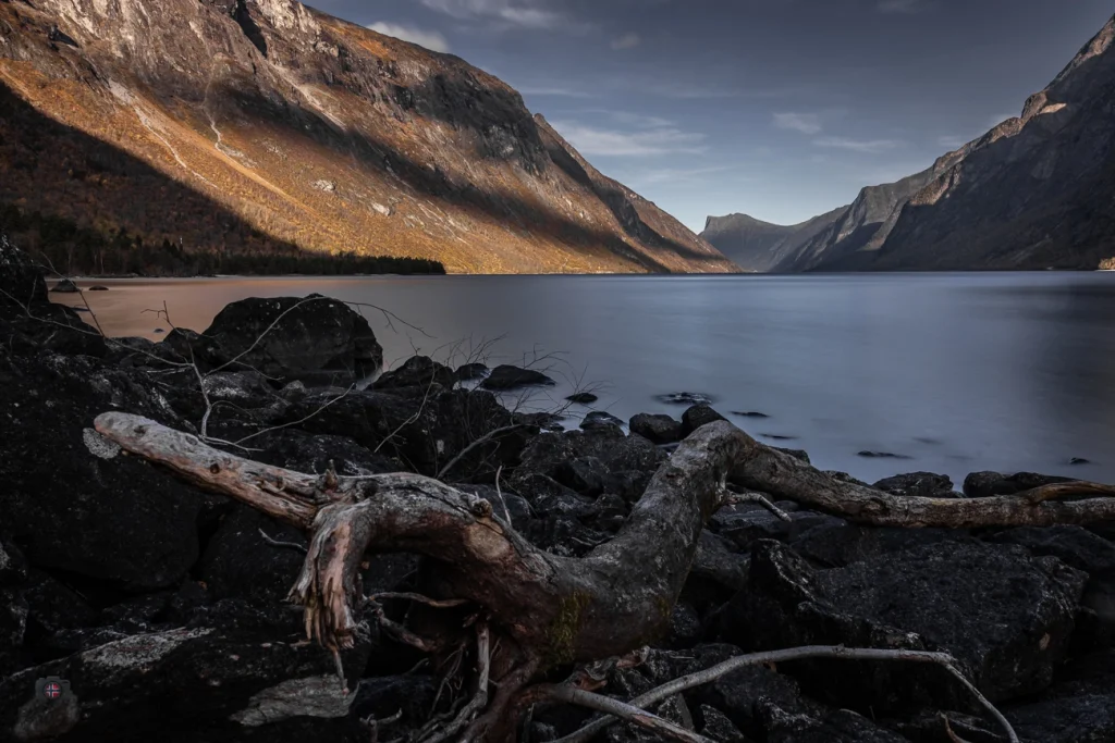
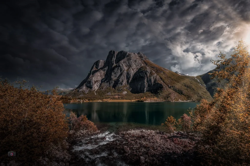
I keep asking myself the same question whenever I am out with my camera, especially in the quiet moments between light and darkness: should this photograph be in colour, or should it speak in black and white?
Both have their own truth. Colour shows what the light was really like: warm, golden, pale pink or cool blue. It brings a sense of closeness and makes an image feel alive. Especially at sunrise and sunset, colour is often what takes our breath away, that fleeting glow setting the sky alight.
But then there is the other option: black and white.
It reduces what we see and, in doing so, reveals more. It removes distractions and directs attention to forms, lines and contrasts. A solitary tree stands in the wind. Light moves across its trunk. Everything seems timeless.
In landscape photography, colour is often part of the experience. But a black-and-white photograph is no less a landscape. Perhaps it simply has another kind of depth, one that expresses more than it shows.
When I photograph a sunset in colour, I tell a story about the light. When I show it in black and white, I tell a story about the moment in between, about stillness, farewell and what remains.
In the end, I do not decide with my eyes alone. I follow my instincts and what the place seems to be telling me.
Lately, it has been telling me more and more often to take away the colour and show only what remains. Perhaps it is time to see and feel more in black and white.
12 responses to “What Remains When Colour Fades?”
-
I find that taking a color image from color to grayscale or BW can sometime very much enhance an otherwise undesirable image. Love your photos!!
-
I completely agree with you, John. Black and white photos speak a completely different language.
-
-
Hallo Dirk, bei dem ersten Bild wäre ich mit SW dabei. Bei dem zweiten Bild, würde ich Farbe vorziehen. Aber dies ist wie immer bei der Fotografie Ansichtssache.
Liebe Grüße, Roland-
Genauso sehe ich das auch, Roland! Vielen Dank für deinen Kommentar!
-
-
-
Thanks! 😉
-
-
Sehr schön gegenübergestellt. Ich teile deine Ansicht voll und ganz.
Viele Grüße Horst-
Hallo Horst! Schön, dass du dir wieder etwas Zeit genommen hast um zu kommentieren!
-
-
Great shots, and yes the black&white changes much more one would think. I love it.
-
Thank you for your comment. I really appreciated it. Constructive opinions are very important to me. Thank you!
-
-
Die Entscheidung ist wohl eine persönliche.
Für mich ist eine SW Aufnahme dann angesagt, wenn eine Struktur hervorgehoben werden soll ohne durch die Farbe beeinflusst zu sein. Beim Sonnenuntergang ist es also dann sinnig, wenn es einer mit beeindruckenden Wolken ist, wie bei deinem zweiten Bild. Der Blick geht sofort dorthin und gibt eine Stimmung vor. Die Farben waren sowieso nicht sehr kräftig, sodass man hier gut verzichten kann.
Auch beim ersten Bild finde ich die Strukturen wichtiger als die Farbe.Liebe Grüße und Dank fürs Teilhabenlassen,
Syntaxia-
Da bin ich ganz bei dir – es ist wirklich eine persönliche Entscheidung, und genau das macht es spannend. Die Idee, gezielt auf Farbe zu verzichten, um Strukturen und Formen in den Vordergrund zu rücken, finde ich sehr stimmig. Gerade bei eher zurückhaltenden Farben, wie bei diesem Sonnenuntergang, kann Schwarzweiß die Bildwirkung sogar verstärken. Danke für deinen Blick darauf – der Gedanke mit der Wolkenstimmung im zweiten Bild trifft es sehr gut!
-
Leave a Reply