A photograph does not automatically become better simply because its colours are removed. Yet I often see landscape photographs converted to black and white in the hope that they will look more dramatic, quieter or somehow more artistic. Sometimes that works. Just as often, all that remains is a colour photograph without its colour.
For me, black and white photography is a deliberate decision about composition. It starts with the subject and the light. I need to see what will hold a landscape together once its colours disappear. A striking rock, a solitary tree or a sequence of barely visible mountain ridges can become stronger. Another photograph may lose the very thing that made it special.
This is about subjects, contrast, tonal values and how I develop black and white images in Lightroom Classic. Above all, it is about knowing when a monochrome photograph is worth making.
Black and white photography starts with the subject
In landscape photography, colour is often what catches our eye first. Warm evening light, green moss between dark rocks, or the blue of a clear winter scene. For a good black and white photograph, I look differently. I pay more attention to a mountain’s silhouette, the direction of a line, and the relationship between light and dark areas.
A subject with a strong shape does not necessarily need colour. In my photograph “A Shape in the Landscape”, it was the mountain’s silhouette that caught my attention. Black and white brings that shape forward. The scene becomes easier to read without losing its impact.
This is especially true of mist, still water, rock formations and barren landscapes. But simplicity is not a goal in itself. If a subject has no clear structure in colour, converting it to black and white will rarely rescue it.
Light, shadows and tonal values
Without colour, differences in brightness have to separate the elements of a photograph. It is not simply a matter of deep blacks and brilliant whites. There is a whole range of grey tones between them, and those subtle transitions can create a sense of depth.
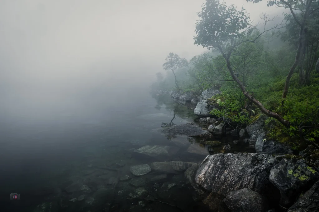
Side light brings out textures. Backlighting can emphasise silhouettes. Hard light creates pronounced transitions between brightness and shadow. Mist reduces contrast, allowing distant mountains to disappear gradually into grey. That can be just as compelling in black and white. A photograph does not need harsh contrast to have character.

Before editing, I therefore ask whether the tonal values separate the important parts of the scene. Two areas can look very different in colour but become almost the same shade of grey. When that happens, a distinction that mattered to the composition may disappear.
Fewer elements, stronger impact
A reduced scene often works particularly well in black and white. In my photograph “Stranded”, the weathered hull of a ship becomes a single, clearly defined shape between still water and an open sky. Those empty areas give the subject room to breathe. In monochrome, the wreck’s silhouette, subtle tonal differences and negative space become the essential elements of the composition.
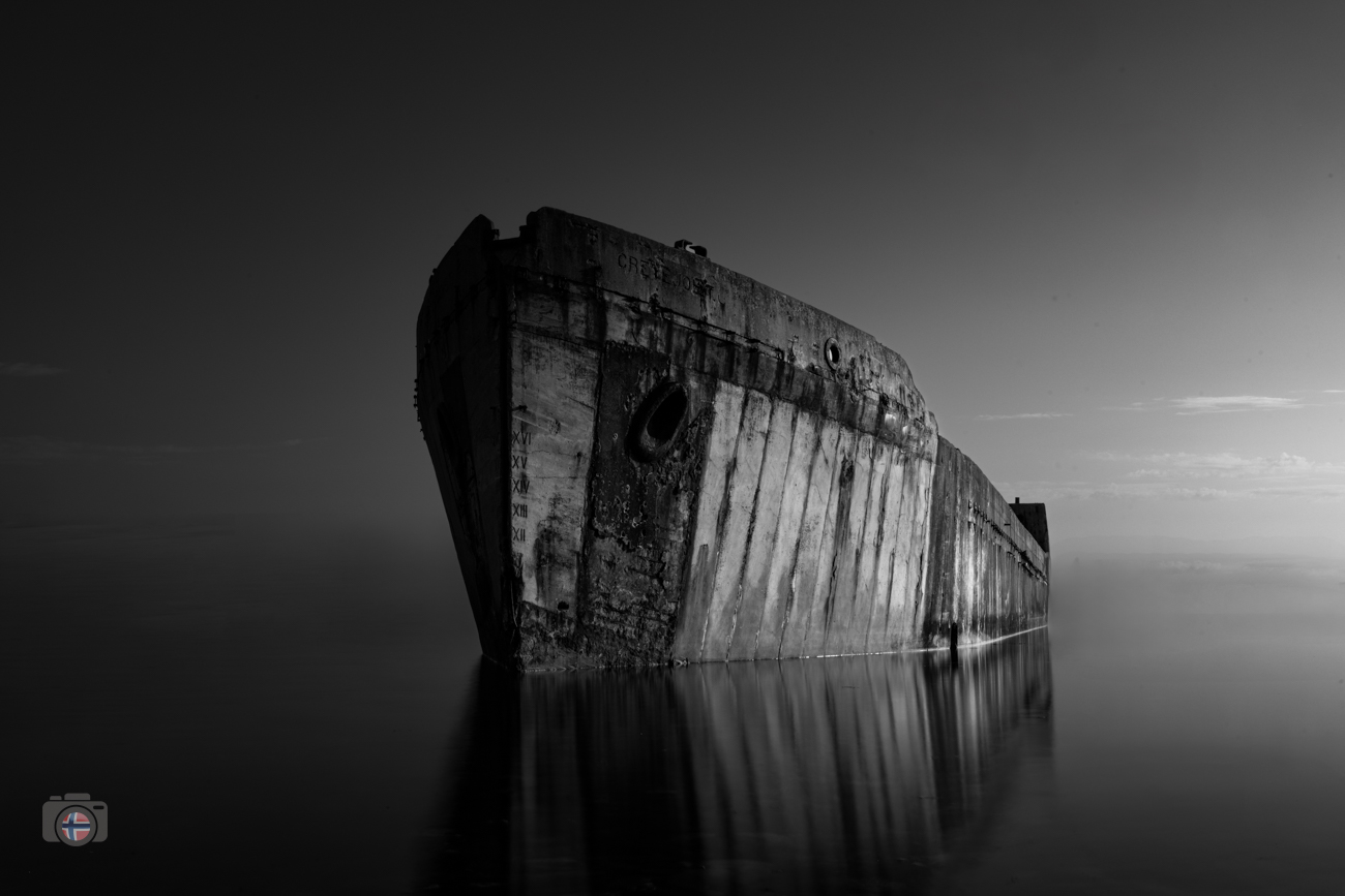
Subjects like this do not require spectacular locations. A narrow strip of light, the texture of a stone or a single form can be enough. This is one of the things that interests me most about Fine Art landscape photography: showing less of the surrounding world and more of what actually caught my eye.
When colour is the better choice
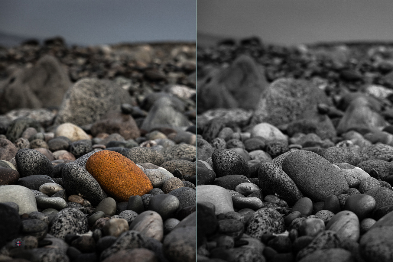
There are also photographs that I believe should stay in colour. A good example is “The Outlier”, from my project “Among the Stones”. One orange stone lies among countless grey pebbles. Its colour sets it apart, and the eye finds it immediately.

If I simply converted this photograph to black and white, the orange stone might disappear into its surroundings. Of course, I could change its grey value during editing. But why remove a key element of the composition and then try to recreate its effect artificially? In this photograph, colour belongs to the subject.
The same applies to certain qualities of light. A sunset can depend on the transition between warm and cool colours. Sometimes that atmosphere is exactly what I want to preserve. I wrote more about this personal choice in my earlier journal piece “What Remains When Colour Fades?”.
Editing black and white photographs in Lightroom Classic
I photograph my landscapes in RAW format, so I can still choose between colour and black and white after the shoot. A monochrome preview in the camera can help me assess shape and brightness while I am out in the field. With a conventional colour digital camera, the RAW file retains the original colour information.
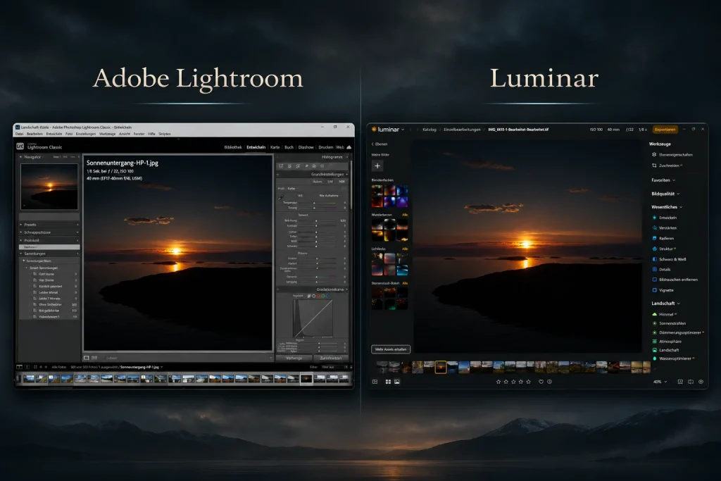
In Lightroom Classic, I start with exposure and check the balance of highlights and shadows. Then I use the Black & White Mix to control how the original colours are converted into shades of grey. This allows me, for example, to separate a bright cloud from the sky or bring out the presence of a rock.
I prefer precise adjustments over pushing a single contrast slider too far. A dark foreground does not have to be completely black, and bright areas can retain detail. Local adjustments can help guide the viewer’s eye. If I find myself pushing the sliders harder and harder to make a subject interesting, I go back and look at the colour version again.
Black and white is a decision, not a quality filter
For some landscapes, black and white is exactly the right visual language. Shapes become clearer, the atmosphere can feel quieter or more austere, and light gains importance. Other photographs depend on their colour. I value both approaches equally.
What matters is what I want the photograph to say. Editing should support that decision, not replace it. To me, a successful black and white photograph is one in which I do not miss the colours.
2 responses to “Schwarzweißfotografie: Motive, Licht und Bildgestaltung”
-
Always amazing photos, Dirk!!
-
Toll aufgearbeitet!


Leave a Reply